このページでは、Midjourney、Photoshop、Illustrator、CLIP STUDIO PAINTなどを用いて制作した、AIと手作業によるオリジナル作品を掲載しています。 テーマや技法にとらわれず、ビジュアルとしての印象・構成・配色の可能性を探りながら、表現の幅を広げ、制作技術の向上を目指して取り組んでいます。
多様性色覚アート
人はみな、それぞれに異なる世界を見ています。
色覚だけでなく、価値観や思考、感性の違いもまた、見えるものを形づくっています。
だからこそ、「十人十色」という言葉が生まれたのかもしれません。
それでも、「きれいだね」や「おいしいね」といった感覚を、誰かと共有できたとき、
私たちは喜びやあたたかさを感じることがあります。
それは、人と人とをつなぐ、静かで確かな力を持っていると私は思います。
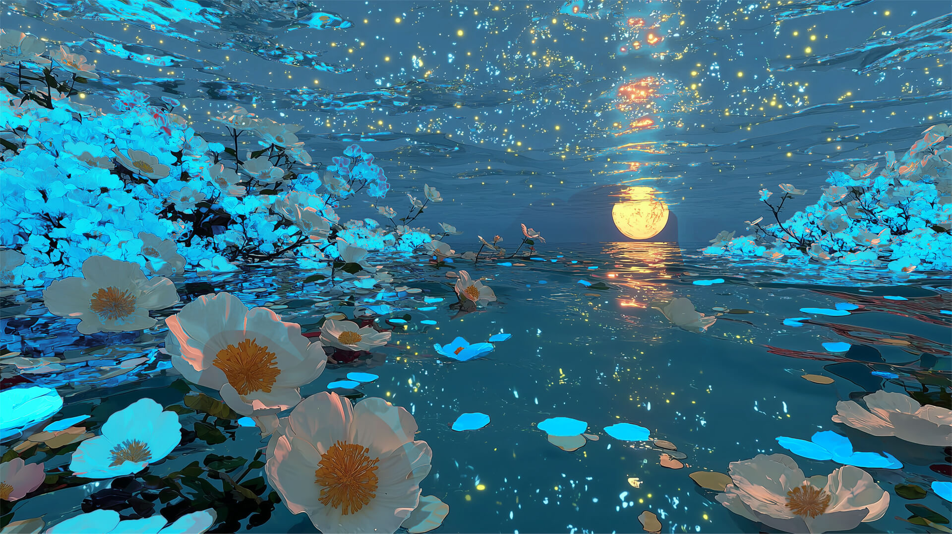
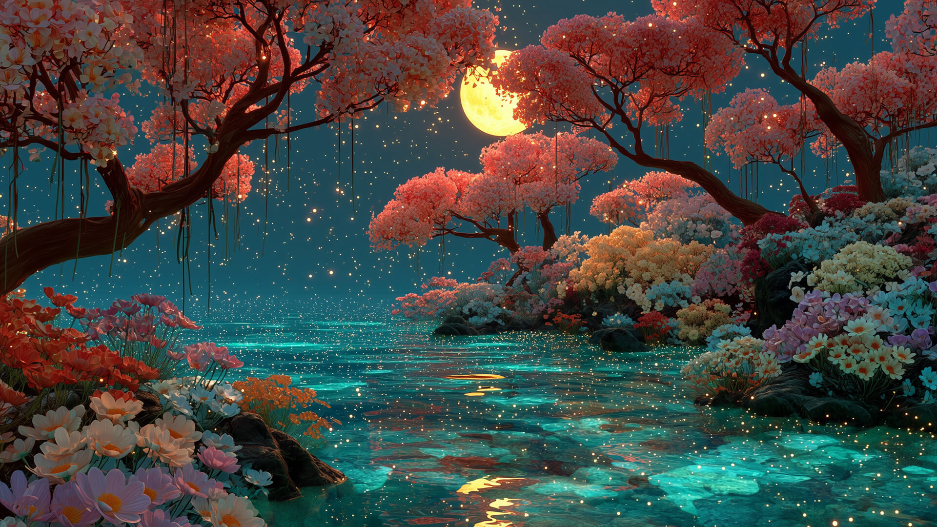
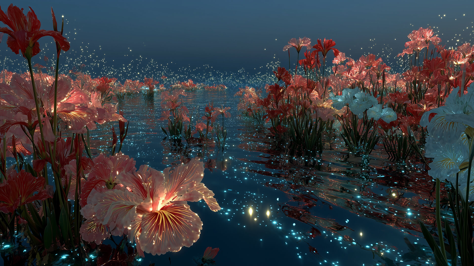
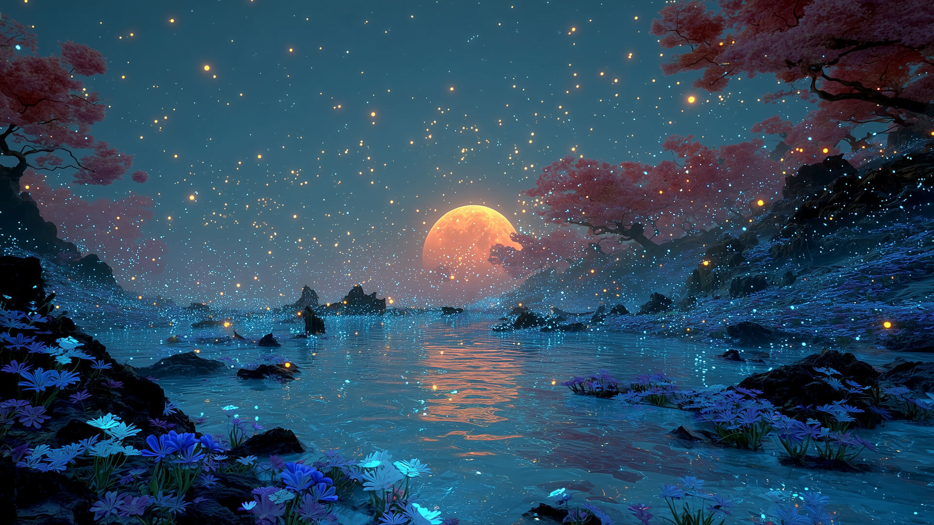
そんな想いから、私はどの色覚でも自然に美しく見える「光」に着目し、
見る人それぞれの違いを前提としたヴィジュアルの制作をはじめました。
ひとりでも多くの人が、誰かと笑顔でつながっていけますように。
Everyone sees the world in a different way.
Not only color perception,
but also differences in values, thoughts, and sensibilities
shape what each person sees.
Perhaps that is why the phrase “ten people, ten colors” exists.
Even so, when we are able to share a feeling like
“this is beautiful” or “this is delicious” with someone,
we often feel joy and warmth.
I believe that such moments hold a quiet but genuine power to connect people.
With this in mind, I started creating visual works
with the understanding that each viewer sees things differently,
focusing on light as something that can be naturally beautiful
across all types of color perception.
I hope my work helps more people connect with others through shared smiles.
使用ツール: Midjourney , Photoshop
Artwork
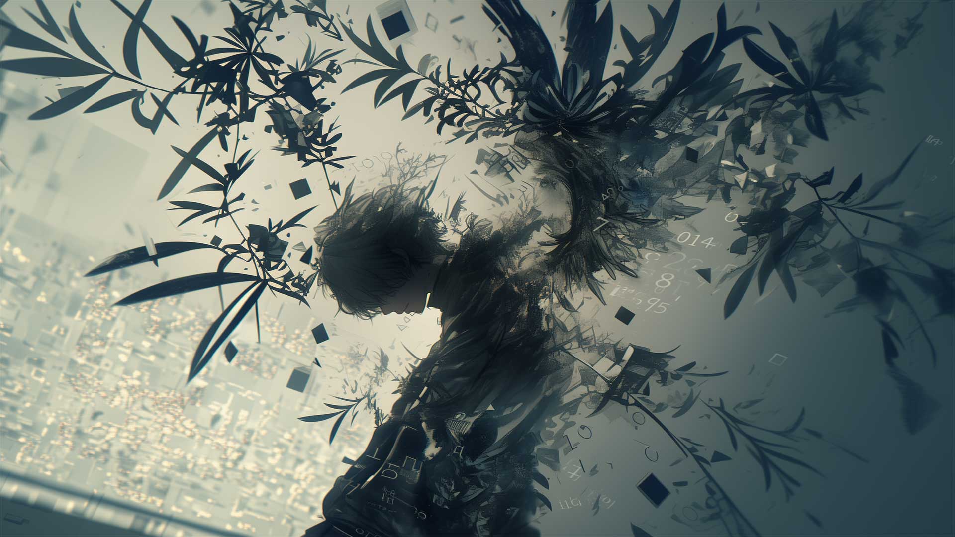
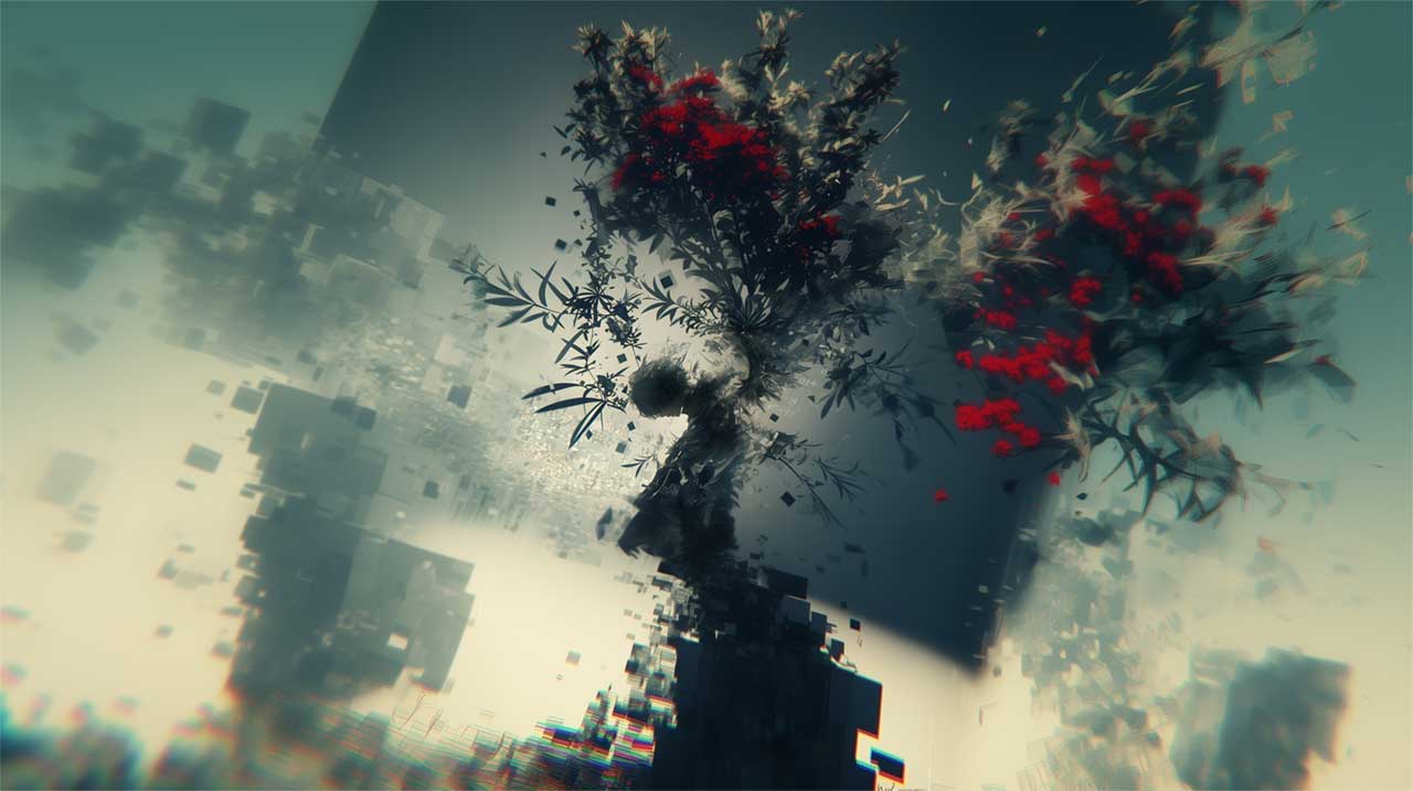
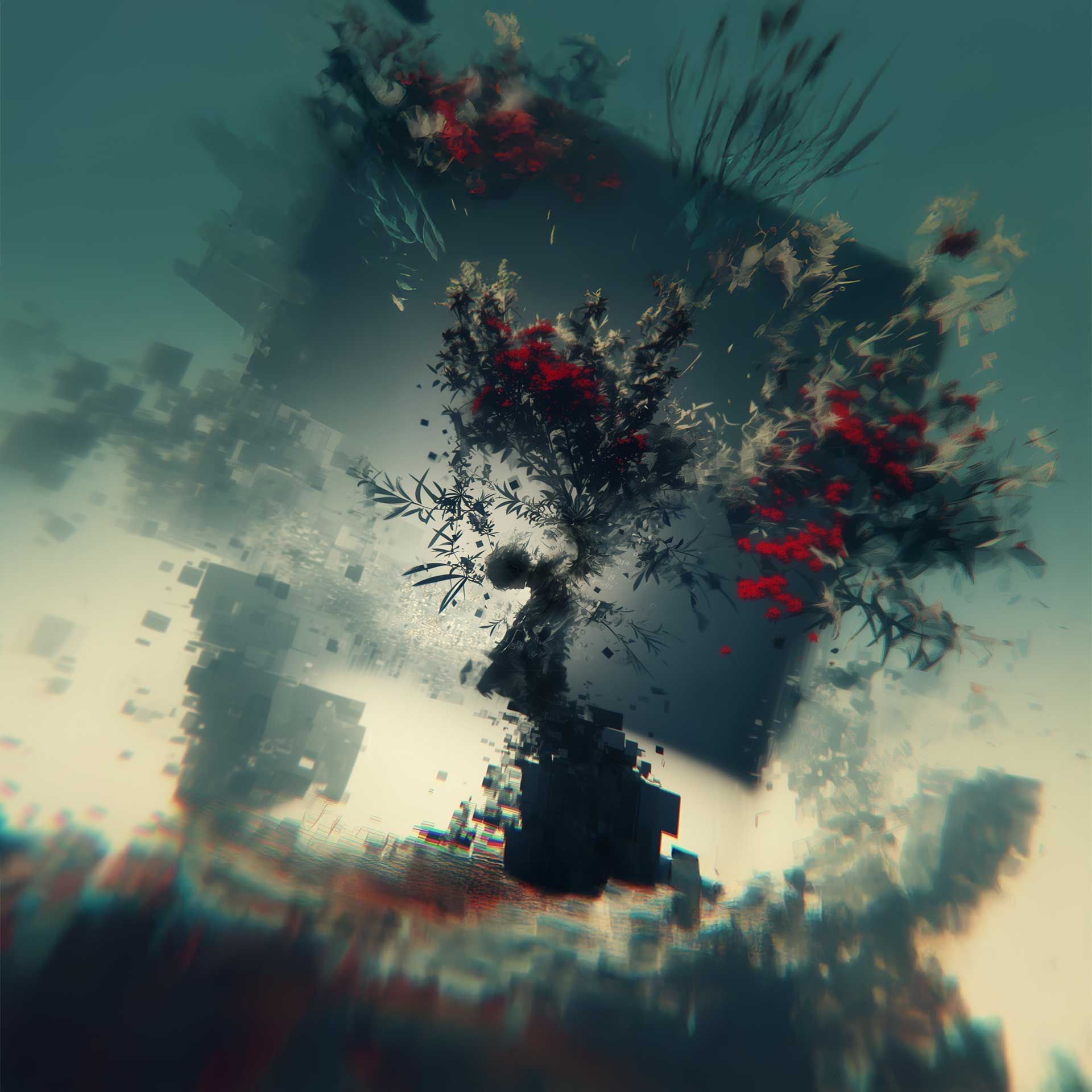
MidjourneyとPhotoshopを使用し、1920×1080のバストアップ構図をベースに、
その周囲を拡張することで、各種アスペクト比に対応可能なデザインを構築しました。
画像をタテヨコにトリミングしても違和感がないよう設計しています。
また、使用する媒体によって視界が自然に広がったり、被写体に近づいたように感じられるよう工夫し、
視覚的な刺激を与えながら、見る人を飽きさせない設計を意識しています。
Using Midjourney and Photoshop, I created a design
based on a 1920×1080 bust-up composition
and extended the surrounding graphics to support various aspect ratios.
The layout is designed so that it can be cropped
both vertically and horizontally without feeling unnatural.
Additionally, by allowing the visual field to naturally expand or zoom
depending on the medium,
the design stimulates visual engagement
and helps prevent viewer fatigue.